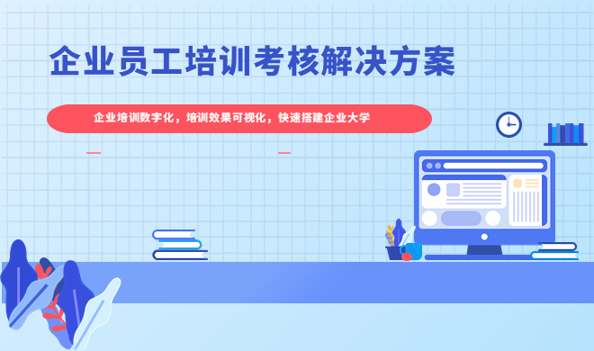
 科汛网校系列(源码部署)
 培训考核系列(源码部署)
 科汛云开店SaaS平台
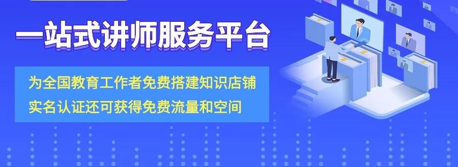
科汛网校系列(源码部署)培训考核系列(源码部署)科汛云开店SaaS平台
科汛云开店SaaS平台
科汛网校系列(源码部署)培训考核系列(源码部署)科汛云开店SaaS平台以下为大家介绍小程序开发过程中,小程序组件的使用教程。小程序组件是小程序开发中非常重要的部分,是开发者必须掌握的技能。

icon组件有3个属性,如下:
再看具体的wxml和wxss。
<code class="language-wxml hljs fsharp has-numbering"><view class="demo-view-4">
    <view class="view-1">
        <icon class="margin" type="circle">
        <view class="margin">circle:多选未选中</view>
    </icon></view>
    <view class="view-1">
        <icon class="margin" type="success">
        <view class="margin">success:成功或已选中</view>
    </icon></view>
    <view class="view-1">
        <icon class="margin" type="success_no_circle">
        <view class="margin">success_no_circle:单选已选中</view>
    </icon></view>
    <view class="view-1">
        <icon class="margin" type="info">
        <view class="margin">info:信息提示</view>
    </icon></view>
    <view class="view-1">
        <icon class="margin" color="#C9C9C9" type="warn">
        <view class="margin">warn-#C9C9C9:普通警告</view>
    </icon></view>
    <view class="view-1">
        <icon class="margin" type="warn">
        <view class="margin">warn:强烈警告</view>
    </icon></view>
    <view class="view-1">
        <icon class="margin" type="waiting">
        <view class="margin">waiting:等待</view>
    </icon></view>
    <view class="view-1">
        <icon class="margin" type="download">
        <view class="margin">download:可下载</view>
    </icon></view>
    <view class="view-1">
        <icon class="margin" type="info_circle">
        <view class="margin">info_circle:有信息提示</view>
    </icon></view>
    <view class="view-1">
        <icon class="margin" type="cancel">
        <view class="margin">cancel:停止或关闭</view>
    </icon></view>
    <view class="view-1">
        <icon class="margin" type="search">
        <view class="margin">search:搜索</view>
    </icon></view>

    <view class="view-1">
        <icon class="margin" type="clear">
        <view class="margin">clear:删除</view>
    </icon></view>

    <view class="view-1">
        <view class="margin">PS:每个type都可以设置颜色(color),大小(size)</view>

    </view>


</view></code></pre>
<pre class="prettyprint" name="code">
<code class="language-css hljs  has-numbering">.demo-view-4{
    display:flex;
    height: 100%;
    flex-direction: column;
}

.view-1{
    display:flex;
    height: 100%;
    flex-direction: row;
}

.margin{
    margin: 20rpx;
}</code>
wxml如下:
<code class="language-xml hljs has-numbering"><text>My name is wisely。\n I am a Androider!</text></code>
progress组件的属性如下:
| 属性名 | 类型 | 默认值 | 说明 |
|---|---|---|---|
| percent | Float | 无 | 百分比0~100 |
| show-info | Boolean | false | 在进度条右侧显示百分比 |
| stroke-width | Number | 6 | 进度条线的宽度,单位px |
|
|
|
|
|
| activeColor | Color | 已选择的进度条的颜色 | |
| backgroundColor | Color | 未选择的进度条的颜色 | |
| active | Boolean | false | 进度条从左往右的动画 |
KESION 科汛软件
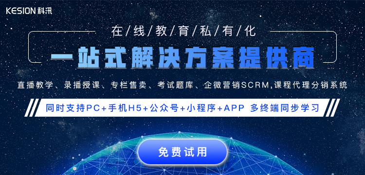
KESION 科汛软件是国内领先的在线教育软件及私域社交电商软件服务提供商,长期专注于为企业提供在线教育软件及社交电商SaaS平台解决方案。
公司核心产品云开店SaaS社交电商服务平台、在线教育SaaS服务平台、教育企业数字化SaaS云平台、企微营销助手、私有化独立部署品牌网校和在线教育咨询等。KESION 不断通过技术创新,提供产品和服务,助力企业向数字化转型,通过科技驱动商业革新,让商业变得更智慧!
微信小程序的swiper 组件 是滑块视图容器,也就是说平常我们看到的轮播图就可以用它来做,不过这个组件有很多样式是固定的,但是,有时候我们的设计稿的面板指示点是需要个性化...
小程序商城购物车功能是非常普遍的一个为大家介绍的就是购物车,这里演示从商品列表中添加到购物车。...
科汛专注于在线教育软件及私域社交电商SaaS平台解决方案,让商业经营更简单。
地址:厦门市观音山国际商务中心6号楼606号
电话:400-008-0263/0596-2218051
邮箱:partner@kesion.com


国家高新技术认定企业
ISO20000
ISO27001
OHSAS18001
 闽公网安备 35020302001540号 统一社会信用代码:91350206MA2XN2XQ4A
国家高新技术企业编号:GR201735100465 软件企业证书号:厦RQ-2017-0034
软件产品证书号:厦RC-2017-0005
认证联盟企业编号:928180109031687687593 国际权威认证:信息技术服务管理体系标准(ISO 20000) 信息安全管理体系国际认证(ISO/IEC 27001)
闽公网安备 35020302001540号 统一社会信用代码:91350206MA2XN2XQ4A
国家高新技术企业编号:GR201735100465 软件企业证书号:厦RQ-2017-0034
软件产品证书号:厦RC-2017-0005
认证联盟企业编号:928180109031687687593 国际权威认证:信息技术服务管理体系标准(ISO 20000) 信息安全管理体系国际认证(ISO/IEC 27001)


 科汛其他产品


